Past Event: Nov 09, 2023
Retrouvez Boxfusion Consulting lors de l’événement Oracle Applications Unlimited Days, en France
1 min read

Author: Jake Patterson
5 min read
Welcome to the second part in this four part series looking at some of the user experience benefits of implementing Siebel Open UI. In the previous post we looked at some innovative ways to improve data visualisation within Siebel, and in this post I will be discussing a number of ways in which we can make small changes to the user interface in order to improve the overall user experience – this might be to improve the intuitiveness of the interface or to simplify common tasks in order to help users complete their work more efficiently and effectively.
The examples you’ll see in this post have been implemented by me in my own ‘sandbox’ environment, which I’ve been using extensively since the release of Siebel Open UI to learn more about the framework and to experiment with new ideas and functionality. You’ll see from the screenshots that I’ve also changed the branding of the application to match the Boxfusion Consulting corporate colour scheme; that’s still a work in progress but when it’s finished I will be writing another post exploring the possibilities and technical aspects involved when adding branding and themes to Siebel Open UI applications.
It’s worth mentioning that while I will be focusing my discussion on the specific changes I have been making, Open UI itself brings a huge number of improvements to the Siebel user experience out of the box in terms of both usability and functionality. The great thing about Open UI is that on top of the functionality it brings, it allows us to customise every aspect of the user interface – and that’s no exaggeration! Using the Open UI framework, the Siebel user interface can be radically customised to suit the exact needs of each individual organisation. That allows us to implement some truly innovative changes in ways which would not have been possible in Siebel before now.
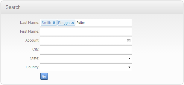
I have implemented a number of concepts to demonstrate the ways in which the user experience could be improved by extending Open UI. In the first, which you can see in the screenshot below, I’ve built a Facebook-style tagging mechanism which can be used to help build Siebel queries – the user can query for multiple contacts by adding names to the input box, and they can change and remove names quickly and easily. Siebel then takes care of building the query by adding ‘OR’ clauses as appropriate.<
 Tagging the names of contacts in your search is more intuitive than using Siebel’s query syntax.
I feel this example demonstrates quite effectively the way that we can make use of Open UI’s extensibility to solve any usability issues which may be experienced by our Siebel users and provide new, easier ways of interacting with the application.
Another modification I have made involves displaying dates in a more user-friendly way. In this example I have extended the Siebel Open UI functionality to display dates in a format which can be very quickly understood while skimming through records; values such as 20/04/2013 14:11:52 are not particularly readable so – by making use of a third-party extension – I introduced the possibility of showing the date of a service request in a format such as “3 months ago”, “two hours ago” or even “less than a minute ago.” Again this example is fairly simplistic but it allows us to provide information in a way which can be understood at-a-glance – and users could find that very helpful when searching for records in Siebel! You can see a couple of examples of this functionality in the screenshot below.
 Displaying the time in a more 'friendly' format helps users quickly identify the record they need.
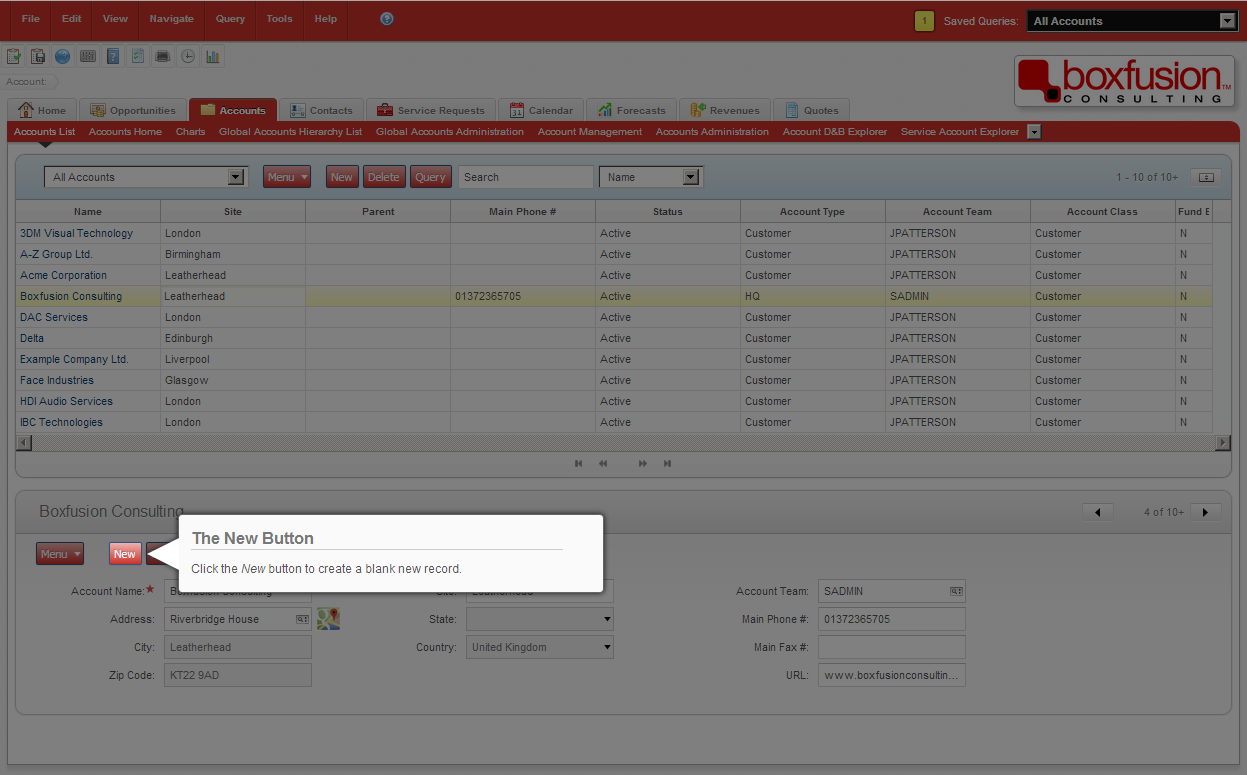
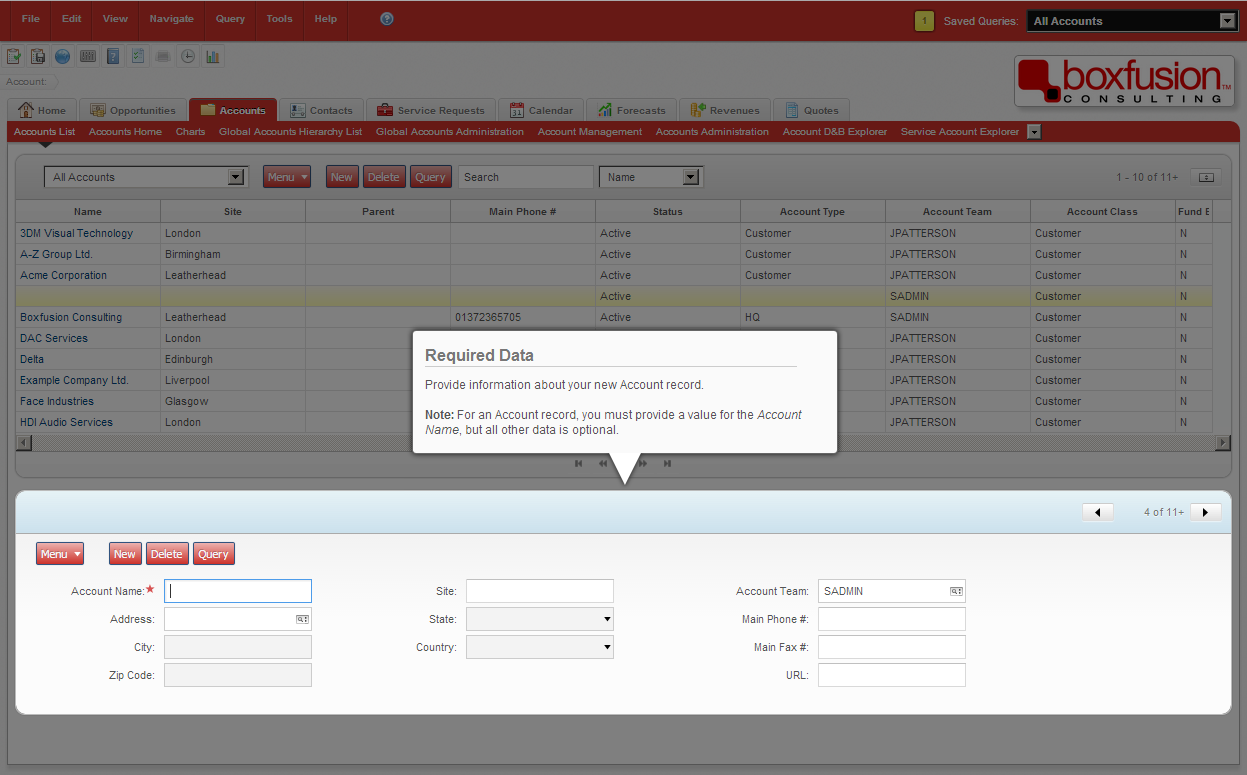
For the final example in this post I would like to demonstrate a simple ‘help provider’ function which I created to guide users through long tasks. Behaving like a sort of souped-up iHelp; this help provider can not only highlight elements on the page but can also respond to user actions such as clicking buttons and inputting data, and can even follow the user’s flow between screens and views. This is a good example of the extent to which we can interact with the Siebel user interface using Open UI: having the ability to manipulate the entire screen and respond to events as the user works is an extremely powerful tool and could be taken advantage of to bring real usability improvements to business processes and other parts of the application. You can see my help provider in action in the screenshots below.
 Pointing out the correct parts of the screen can help familiarise users with the application, and help them to remember which steps they need to take to complete a process.
 Highlighting the relevant section of a screen helps to make processes easier to follow by freeing users from distraction – the UI feels simpler and more intuitive.
I hope you have found the three examples covered in this post interesting! They demonstrate the possibilities that the Siebel Open UI framework makes available to us; by using Siebel Open UI, we can provide modern, easy-to-use and engaging user interfaces which truly live up to the expectations set by today’s modern websites and applications. In addition though, it allows us to take into account other considerations such as user preferences and accessibility concerns, in a way which is not possible in most current Siebel implementations.
In the next post in this series I will discuss the power that Siebel Open UI provides to integrate with external services and websites in order to supplement and enrich the data stored within Siebel.
1 min read
6 min read
4 min read